Branch Carousel Component Mini-project
Design system contribution with Branch experience carousel component
Project summary
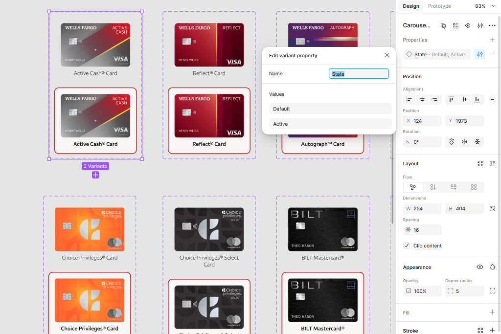
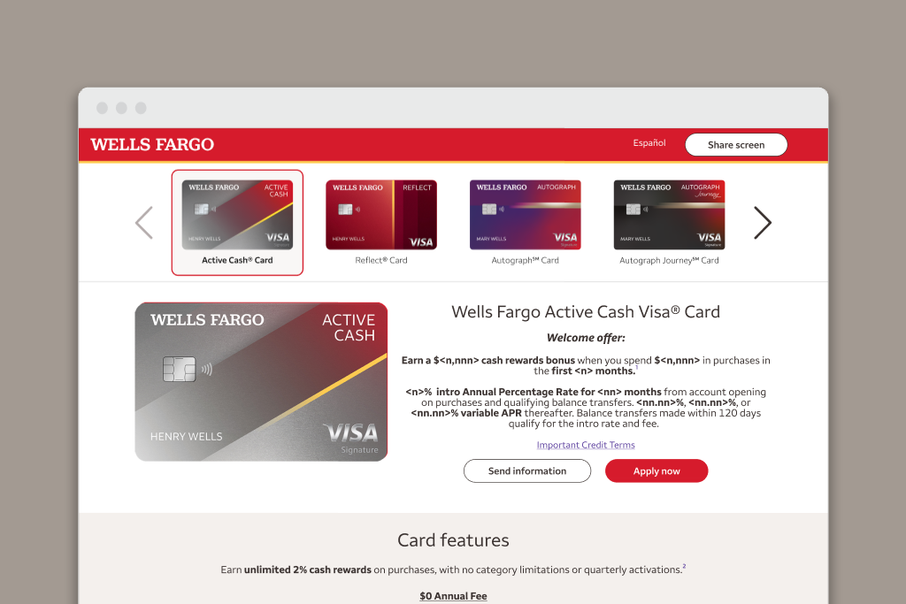
The need arose to create a standardized carousel component for the Branch experience on the OMNI platform after multiple MVP releases and growth of design pages. The impact became very time consuming to apply a simple change update over 20+ frames over 10+ pages and multiple files. The flip side was the first version of the carousel was not aligned with the design system construct and styling standards. Initially, this did provide enough of a design concept to be adapted for low design frame integration, but to make the carousel really designer friendly, an overhaul to componentization path was needed. I was then tasked with creating a new version of the carousel as a master component that would be reusable across different Branch experience designs with the use of properties to standardize the styling states of active/non-active elements.
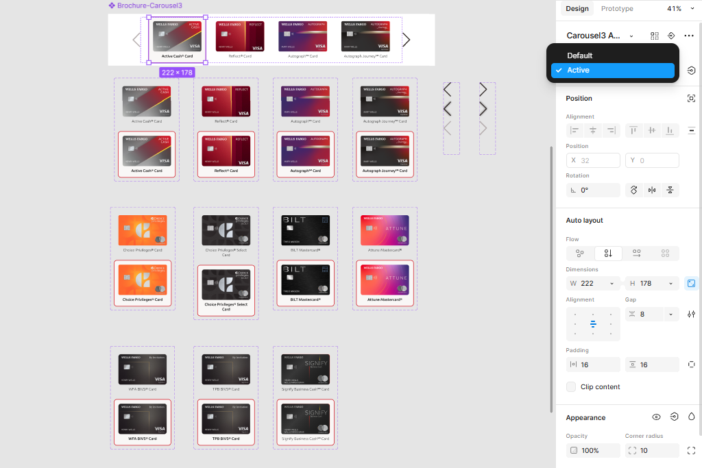
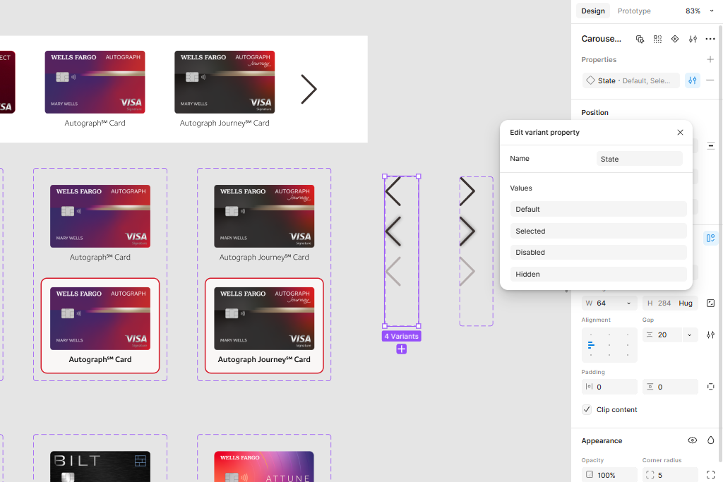
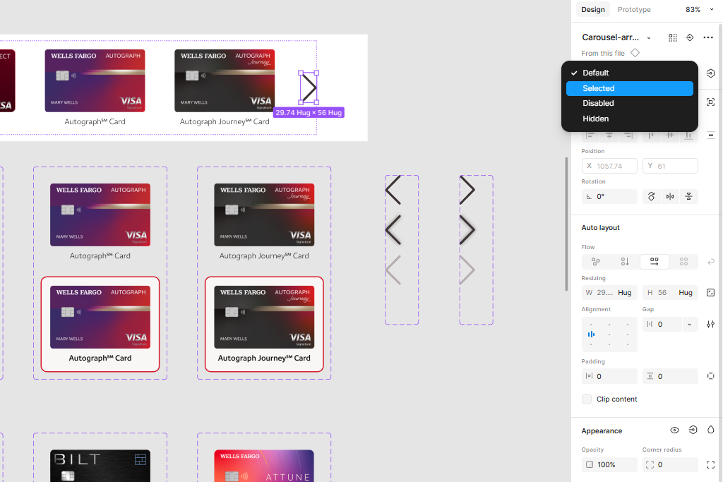
The new version carousel component was designed to be flexible and customizable, allowing for placement in responsive content layouts. The new component also utilizes Figma variants for each of the credit card product items, and also the carousel direction arrows to allow for the configuration of combined states depending on the prototype workflow. The component is in a separate Figma file that can be imported into the main design system library, allowing for easy access, cross file applied updates, and re-usability by the marketing branch design team. This update opened the door so the prototype design can be used in part with the transition strategies presentation scope. For example, the direction arrows can be configured in prototype mode to transition back or forth between design frames and dipict the selected state of the carousel item. By using the the Atomic Design methodology on this work effort, the flexibility in iterations with component specific pieces helped with the delivery efficiency to the consuming child component design files whilst avoiding breaking changes and refactoring.
All the designs would utilize the latest brand standards library of components, design philosophy, and color schematics to stay aligned with the overall enterprise branding strategy utilizing the brand's Fusion design language. A react.js component library was created to allow the development team to utilize the components in a more efficient manner.
Skills: Banker User Experience · Figma · SASS/CSS
Project information
- Category Web application design
- Business stakeholders Design System Component Library
- Project date Dec 2024 - Jan 2025
- Project URL Internal intranet